Laptop Mockup Tutorial: Show Your Website in 3D, Step by Step
in short
To make a laptop mockup of your website, capture a sharp screenshot at the laptop screen's proportions. Place it on a 3D laptop model, choose an angle and lighting, then export at 2× as WebP or PNG. In mockiso this takes a few minutes in the browser.
To make a laptop mockup of a website, capture a crisp screenshot that matches the laptop screen's proportions. Place it on a 3D laptop model, pick a camera angle and lighting, then export at 2× resolution. With a browser tool like mockiso, the whole process takes a few minutes and you don't need Photoshop or a PSD template.
This tutorial covers each step: preparing the screenshot, framing it, and exporting a file that looks sharp on a landing page without slowing the page down.
What is a laptop mockup?
A laptop mockup is an image that shows a real screenshot of a website or web app on the screen of a realistic laptop model. Visitors see the product in context and don't have to interpret a bare browser window. Designers and founders use laptop mockups for landing page hero images, portfolio case studies, pitch decks, social posts and launch galleries.
A 3D laptop mockup goes further than a flat frame. You can rotate the device, change the lens and add lighting and shadows, so you get several hero shots or side views from a single screenshot. If you're not sure a device frame helps at all, read when to use device mockups (and when plain screenshots win) and 3D vs flat mockups.
What screenshot size works best for a laptop mockup?
Use a high-resolution screenshot (2× pixel density) that roughly matches the laptop screen's aspect ratio. The 14-inch MacBook Pro, for example, has a native resolution of 3024 × 1964 px according to Apple's MacBook Pro tech specs. That's about a 1.54:1 ratio, which is taller than a standard 16:9 monitor.
A simple way to get that size is Chrome DevTools device mode. The Chrome DevTools device mode documentation explains how to set exact viewport dimensions, add a device pixel ratio (DPR) and then use More options > Capture screenshot to save what's in the viewport.
Capture checklist
- Open your site in Chrome and press
F12(orCmd+Option+Ion a Mac) to open DevTools, then toggle device mode. - Choose Responsive and type a laptop-like viewport, for example
1512 × 982. - Click More options > Add device pixel ratio and set DPR to
2. Your screenshot comes out at 3024 × 1964 px. - Scroll to the section you want to show, hide cookie banners and chat widgets, and use realistic sample content, not "Lorem ipsum."
- Click More options > Capture screenshot. Use the viewport capture, not "Capture full size screenshot." A full-page capture is far too tall for a laptop screen.
Tip: if you also want a phone in the scene, capture the same page at a mobile viewport now. A mobile capture shows the responsive layout better than a shrunken desktop screenshot.
How do you make a laptop mockup in mockiso?
In mockiso you create a project, pick a laptop model, upload or paste your screenshot, set the angle, lighting and backdrop, then export. Everything renders in the browser with WebGL, so there's nothing to install. New accounts get a 24-hour Pro trial with no card required.
Step 1: Create a project and pick a laptop
Sign up, click New project and choose a laptop from the device library. The options are MacBook Pro 14″, MacBook Air 13″, Surface Laptop, Dell XPS 13, ThinkPad X1 Carbon and Zenbook 14 OLED. None of the models show brand logos, and each one comes in several color variants. Choose a dark finish for light-themed websites and a silver one for dark UIs so the screen stands out from the body.
Step 2: Add your website screenshot
Click the screen area to upload, drag and drop the file, or paste it straight from the clipboard with Ctrl+V / Cmd+V. Pasting is the fastest route if you just captured the page with DevTools or a system screenshot shortcut.
Step 3: Choose an angle
Start with an angle preset: front, hero left/right, side, profile, float, lean back, flat lay or back. If no preset fits, drag the device to rotate it freely. Then fine-tune yaw, pitch, roll and scale.
Step 4: Set the camera lens
The lens slider runs from 24 mm to 135 mm. Short focal lengths (24–35 mm) give a dramatic, close-up perspective. Longer ones (85–135 mm) flatten the scene and keep the screen text nearly undistorted, which suits UI that people need to read.
Step 5: Light the scene
Adjust the studio lighting, exposure, screen reflection and soft shadow. Turn screen reflection down if the screenshot has small text, because glare on a laptop display hides detail quickly. A soft shadow under the base keeps the laptop from looking pasted onto the backdrop.
Step 6: Pick a backdrop and optional caption
Choose a solid color, a gradient, your own image, a transparent background or one of the 70 ready-made backdrop templates. Use a transparent background when the laptop will sit on top of a colored hero section in your site's CSS. You can also add an App Store style caption (a headline and a subline), which is useful when the image will appear on social media or in a launch gallery.
Step 7: Add a phone or tablet (optional)
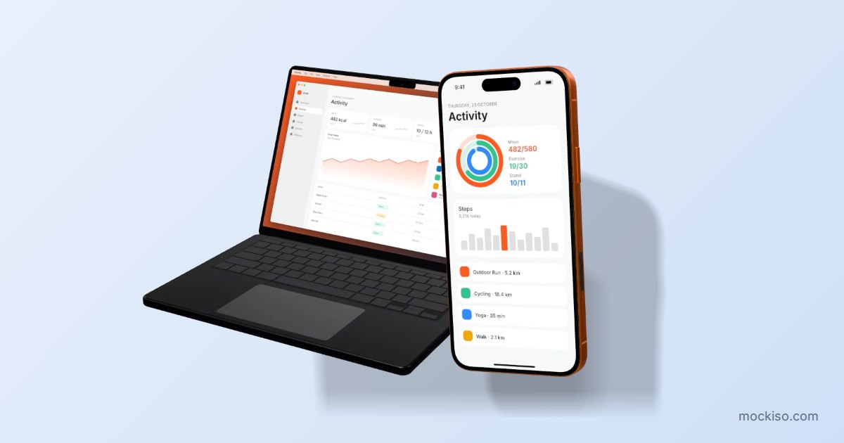
Switch the layout to duo or trio to show several devices with consecutive screenshots. A laptop next to a phone tells visitors at a glance that the product is responsive, which plain screenshots can't do.
Which angle should you use for a website mockup?
Use a front or long-lens view when the screen content must be readable, and an angled hero view when the image is mostly about atmosphere. The table below matches common placements to settings that work well as a starting point.
| Where the image goes | Angle preset | Lens | Backdrop |
|---|---|---|---|
| Landing page hero | Hero left or hero right | 50–85 mm | Transparent or brand gradient |
| Portfolio case study | Front | 85–135 mm | Solid neutral color |
| Social post or launch gallery | Float or lean back | 35–50 mm | Gradient or backdrop template, plus caption |
| Feature section next to text | Side or profile | 50–85 mm | Same color as the page section |
| Flat "desk" composition | Flat lay | 50 mm | Image backdrop |
If you're preparing images for a launch, the same angle logic applies to the gallery format covered in Product Hunt gallery images: sizes, order and mockup tips.
How should you export a laptop mockup for a website?
Export at 2× for sharpness, use WebP for web pages and PNG when you need transparency or lossless quality, then size the file to the space it fills. mockiso exports PNG, JPEG or WebP at 1× or 2×. Tiled rendering goes up to 8192 px, and you can copy the result straight to the clipboard. Canvas size presets cover common store and social media formats.
Hero images affect page speed. According to web.dev's guide to Largest Contentful Paint, <img> elements and CSS background images are among the elements counted for LCP, and sites should aim for an LCP of 2.5 seconds or less. A large laptop mockup at the top of a landing page is often that element, so:
- Export at 2× of the largest size the image will actually display at, not the 8K maximum.
- Prefer WebP for photographic backdrops and gradients. Use PNG when you need a transparent background.
- Serve smaller versions to mobile visitors with
srcset, and don't lazy-load the hero image. - Keep the original 2× PNG for print, decks and future crops.
Need several angles for a page, a deck and social media? Export a ZIP of all angles in one click instead of rendering each view separately. Batch ZIP export and 2× resolution are part of the paid plans, so check pricing for the current limits.
What are common laptop mockup mistakes?
Most weak laptop mockups come from a bad source screenshot, not from the 3D render. Watch out for these issues:
- Low-resolution captures. A 1× screenshot on a 2× export looks soft. Capture at DPR 2.
- Wrong proportions. A full-page capture squeezed onto a laptop screen distorts the layout. Capture only the viewport.
- Leftover clutter. Cookie banners, dev toolbars, browser extensions and personal bookmarks look careless in a hero image.
- Too much angle. Extreme rotation with a 24 mm lens makes headlines unreadable. Save dramatic angles for secondary visuals.
- Low contrast against the backdrop. A silver laptop on a light gray background disappears. Change the device color or the backdrop.
- Outdated UI. Rebuild mockups when the product changes. Autosave keeps each project, so swapping in a new screenshot is quick.
Key takeaways
- A laptop mockup puts a real website screenshot on a realistic laptop model so visitors understand the product at a glance.
- Capture the source at DPR 2 with a laptop-like viewport, such as 1512 × 982, which gives 3024 × 1964 px, the 14-inch MacBook Pro's native resolution.
- Use front or long-lens views (85–135 mm) when text must be legible, and hero angles for atmosphere.
- Export at 2× of the display size, use WebP for web pages and PNG for transparency, and keep hero images light for a good LCP.
- Pair the laptop with a phone in a duo layout to show the site is responsive.
Create your first laptop mockup
A good website mockup comes down to a clean screenshot, a sensible angle and the right export settings. mockiso handles the 3D work in your browser: paste your capture, pick a laptop, rotate, light and export. Start your free 24-hour Pro trial (no card required) and turn your next landing page screenshot into a hero image.
Frequently asked questions
Do I need Photoshop to make a laptop mockup?
No. Browser-based tools like mockiso render 3D laptop mockups with WebGL, so you only need a screenshot and a web browser. PSD templates still work if you already use Photoshop, but they usually offer one fixed angle per file.
Can I make a laptop mockup with a transparent background?
Yes. In mockiso, set the backdrop to transparent and export as PNG, which keeps the alpha channel. The laptop and its shadow can then sit on any colored section of your website or slide.
Which laptop models can I use in mockiso?
mockiso includes the MacBook Pro 14″, MacBook Air 13″, Surface Laptop, Dell XPS 13, ThinkPad X1 Carbon and Zenbook 14 OLED, each with color variants. The models carry no brand logos, so the focus stays on your website.
Should I show a dark-mode or light-mode version of my site in the mockup?
Pick whichever mode most visitors will see, then contrast it with the device and backdrop. A light site often looks best on a dark laptop finish, and a dark UI on silver. Avoid matching the screen and backdrop colors too closely, or the screen edge disappears.
Can I use the same screenshot for a laptop and a phone mockup?
It's better not to. A desktop screenshot shrunk onto a phone screen is unreadable and doesn't show your responsive layout. Capture a separate mobile viewport and use a duo layout to place both devices side by side.
Keep reading
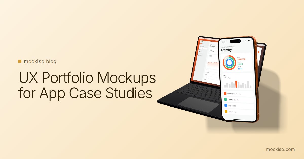
UX Portfolio Mockups: How to Present App Designs in Case Studies
UX portfolio mockups work best as packaging, not proof: use one angled 3D device mockup for the thumbnail and hero image, flat front-facing frames for flows and detail screens, and keep the process work (sketches, research, iterations) visible.
App Store Screenshot Trends 2026: 8 Styles Worth Using
The biggest App Store screenshot trends in 2026 are outcome-first hero frames, panoramic sets, angled 3D devices, frameless UI crops, dark mode frames, Liquid Glass UI, multi-device sets and bold color blocking. Use each one only where store rules allow it.
App Store Screenshot Rejection: 12 Mistakes to Fix First
Most App Store screenshot rejections come from a few fixable mistakes: splash or login screens instead of the app in use, prices or "free" claims, other-platform imagery, real user data, and wrong sizes or transparent PNGs. Google Play adds bans on rankings, awards and promo text.