UX Portfolio Mockups: How to Present App Designs in Case Studies

in short
UX portfolio mockups work best as packaging, not proof: use one angled 3D device mockup for the thumbnail and hero image, flat front-facing frames for flows and detail screens, and keep the process work (sketches, research, iterations) visible.
UX portfolio mockups work best as packaging, not proof. Use one polished, angled device mockup for each case study's thumbnail and hero image. Show flows and detail screens in flat, front-facing frames. Keep your sketches, research and iterations visible, because that process work is what hiring managers are actually evaluating.
This guide is for UX and product designers putting together or refreshing a portfolio. It covers where device mockups help a case study, where they get in the way, and how to produce a consistent set quickly.
What are UX portfolio mockups?
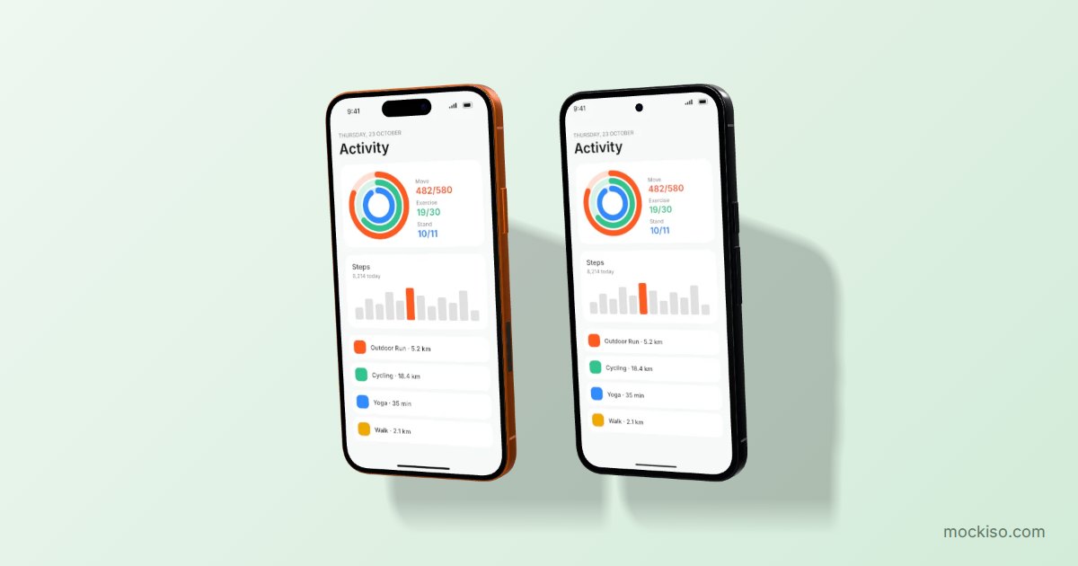
A device mockup is an image that places a real interface screenshot inside a rendered phone, tablet, laptop or monitor frame, so viewers see the design in the context where people would use it. In a UX portfolio, mockups usually appear in three places: the case study thumbnail on your portfolio's home page, the hero image at the top of each case study, and the final-design section near the end.
Mockups are a presentation layer. They make a screen feel like a shipped product, and they make a grid of projects look consistent. But they don't show how you think. The Nielsen Norman Group puts it plainly in 5 Steps to Creating a UX-Design Portfolio: "the final screenshots only tell part of the story." That article also quotes a hiring manager who said, "Don't just show me the finished product. I want to see the messy process."
So the useful question isn't whether to use mockups. It's which parts of the case study they belong in.
Where should mockups go in a UX case study?
Put device mockups at the entry points (thumbnail and hero) and in the final-solution section. Leave research, sketches and wireframes as plain artifacts. Here's how that works out in a typical case study:
| Case study section | Best visual | Mockup style |
|---|---|---|
| Portfolio thumbnail | One recognizable key screen | 3D angled device (hero left/right) on a consistent backdrop |
| Case study hero | Key screen or 2–3 screens of the main flow | Angled single device or duo/trio layout |
| Problem & research | Interview notes, affinity maps, analytics charts | No device frame |
| Ideation | Sketches, whiteboards, low-fi wireframes | No device frame, or a flat frame for mid-fi tests |
| Final solution flow | Consecutive screens of one task | Front-facing frames, side by side |
| Detail / interaction callouts | A single screen with annotations | Front-facing or plain screenshot, readable at full size |
| Responsive or multi-platform work | Same feature on phone, tablet and desktop | Mixed devices, same angle and lighting |
The pattern is simple. Devices go where you need to grab attention, and they come off where you need people to read and understand the work. For a more general take on that tradeoff, see When to Use Device Mockups (and When Plain Screenshots Win).
Should portfolio mockups be angled or flat?
Use angled 3D mockups for thumbnails and hero images, and flat, front-facing mockups for any screen a reviewer needs to read. A perspective view adds depth and makes a thumbnail grid feel premium. It also foreshortens one side of the screen, which makes small text and dense UI harder to read.
Many designers argue that angled mockups hurt communication because they distort hierarchy and crop screens. That criticism is fair when every image in a case study is tilted. It matters much less for a single hero shot whose job is to say "this is a mobile banking app" in half a second.
A practical angle rule
- Thumbnail and hero: a moderate hero-left or hero-right angle, or a gentle float. Avoid extreme rotations.
- Flows: front view, all devices at the same scale, in task order from left to right.
- Annotated details: front view or a plain screenshot, large enough that the callouts line up with the UI.
We compare the two styles in more depth in 3D vs Flat Mockups: When Each Style Works Best.
How do you keep UX portfolio mockups consistent?
Pick one visual system for every project's mockups: the same backdrop family, the same lighting, the same angle for thumbnails and the same device generation. Consistency is what makes a portfolio grid look curated rather than assembled. It also lets the projects themselves stand out instead of the frames.
The Interaction Design Foundation's guide on how to create visuals for your UX case study makes the same point: "your case study's visuals should align with your portfolio's visual identity." In practice that means:
- One backdrop style. For example, a soft gradient in your portfolio's accent color, or a neutral light gray for every thumbnail.
- One thumbnail angle. If project one uses hero-left, they all use hero-left.
- Current devices. An old phone frame can make a recent project look dated. Match the device to the platform you actually designed for (iOS, Android, iPadOS, web).
- Same canvas size. Export every thumbnail at the same aspect ratio so your grid doesn't jump around.
- Real content. Replace lorem ipsum and placeholder avatars before you render. Fake content is easy to spot in a hero image.
How do you show NDA work in a portfolio?
You can still show NDA-protected work if you remove identifying details or rebuild the screens with generic branding, then present them the same way as your other projects. NN/g's portfolio article suggests showing workshop photos, sketches or black-and-white wireframes, blurring identifying details, or recreating designs with generic branding.
Device mockups are useful here. A rebranded, anonymized screen in a clean device frame looks just as finished as public work, so your NDA project doesn't stick out as the "lesser" case study in the grid. Check your contract first, though. Some agreements forbid showing any screens at all, even reworked ones, and in that case process artifacts and a written walkthrough are your only option.
How large should case study images be?
Export images sharp enough for high-density screens, then compress them for the web. Heavy images slow your portfolio down on the exact devices hiring managers use to skim it. The Interaction Design Foundation recommends keeping each image under 100KB where you can, and points to ImageOptim (JPEG), TinyPNG (PNG) and the WebP format as ways to get there. The authors also suggest roughly 60–80% text and 20–40% images in a case study.
A workable approach for UX case study visuals:
- Render mockups at 2× so they stay crisp on retina displays.
- Export hero and thumbnail images as WebP or JPEG. Use PNG only when you need transparency, for example a device floating over your portfolio's own background.
- Run the files through a compressor, then check text legibility at 100% zoom before you publish.
- Use descriptive alt text ("Checkout flow of a grocery app on an iPhone, three screens") instead of "mockup1.png."
How to create portfolio mockups in mockiso
mockiso is a browser-based tool that turns screenshots into 3D device mockups with WebGL, so there's nothing to install. Here's how to produce a matching set of thumbnails, heroes and flow images for every case study.
1. Set up one project per case study
Create an account, click New project, and pick the device that matches the platform you designed for: an iPhone 17 Pro or Pixel 9 Pro for mobile work, an iPad Pro or Galaxy Tab S9 for tablet, a MacBook Pro 14″ or Studio Display for web apps. The full list is on the devices section of the home page.
2. Add your final screens
Upload screenshots by clicking, by drag and drop, or by pasting straight from Figma with Ctrl/Cmd+V. Use real, final content, not wireframes.
3. Lock in your portfolio "house style"
- Choose an angle preset: hero left or hero right for thumbnails, front for flows.
- Set the camera lens. A longer focal length (around 85–135 mm) flattens perspective and keeps the UI more readable than a wide 24 mm lens.
- Pick studio lighting, a subtle screen reflection and a soft shadow, then use the same settings in every project.
- Choose a backdrop (solid color, gradient, image, transparent, or one of the 70 ready-made templates) that matches your portfolio's palette.
4. Build the flow image
Switch the layout to duo or trio to place several devices with consecutive screenshots. This works well for "before → during → after" moments of a single task. Skip the App Store style caption for portfolio images. Your case study text already provides the context.
5. Export for the web
Choose a canvas size, then export PNG, JPEG or WebP. Paid plans include 2× export, no watermark, and ZIP export of all angles at once, which is handy when you need the same screen as both a thumbnail and a hero. The Free plan exports at 1× with a watermark. Current limits are on the pricing page, and every new account gets a 24-hour Pro trial with no card required.
Key takeaways
- Use angled 3D device mockups for portfolio thumbnails and case study heroes. Use front-facing frames or plain screenshots for flows and annotated details.
- Mockups don't replace process: NN/g recommends 3–5 detailed case studies that show the problem, your role, the solution, its impact and what you learned.
- Use the same backdrop, lighting, angle and device generation for every project so the portfolio grid looks curated.
- NDA work can still appear as anonymized or rebranded screens in a device frame, if your contract allows it.
- Render at 2×, then compress. IxDF suggests keeping case study images under about 100KB each and using formats like WebP.
Make your next case study look finished
Good UX portfolio mockups take minutes, not an afternoon in Photoshop. Set your house style once, reuse it for every project, and spend the time you save on writing about your process. Start your free 24-hour Pro trial and render your first case study hero in the browser.
Frequently asked questions
Do hiring managers care whether I use device mockups in my UX portfolio?
Mockups mainly affect first impressions: they make thumbnails and hero images look polished and consistent. Hiring managers evaluate your process, decisions and impact, which mockups cannot show. Treat mockups as packaging and make sure the case study content carries the substance.
Which device should I use for a web app case study?
Use a laptop or desktop frame such as a MacBook Pro 14″, Dell XPS 13 or a 27-inch monitor, and match the screenshot's aspect ratio to the device. If the product is responsive, add a phone frame in the same angle and lighting to show the mobile breakpoint side by side.
Can I use mockups for concept or unshipped projects?
Yes, as long as you label the project clearly as a concept, a course project or an unbuilt proposal. A realistic device frame makes the work easy to read, but presenting a concept as a shipped product can damage trust in an interview.
Should my portfolio thumbnails have a transparent or colored background?
A colored or gradient backdrop is usually easier because the thumbnail looks the same everywhere it is shared, including LinkedIn and Dribbble previews. Transparent PNGs make sense when your portfolio site places the device over its own designed background.
Is it okay to use the same mockup template as other designers?
Common templates are fine, but customizing the backdrop color, angle and lighting to match your own visual identity makes your portfolio more recognizable. Consistency across your projects matters more than being completely unique.
Keep reading
App Store Screenshot Trends 2026: 8 Styles Worth Using
The biggest App Store screenshot trends in 2026 are outcome-first hero frames, panoramic sets, angled 3D devices, frameless UI crops, dark mode frames, Liquid Glass UI, multi-device sets and bold color blocking. Use each one only where store rules allow it.
App Store Screenshot Rejection: 12 Mistakes to Fix First
Most App Store screenshot rejections come from a few fixable mistakes: splash or login screens instead of the app in use, prices or "free" claims, other-platform imagery, real user data, and wrong sizes or transparent PNGs. Google Play adds bans on rankings, awards and promo text.
3D vs Flat Mockups: When Each Style Works Best
Use flat mockups when the interface has to be read: the first App Store screenshots, documentation and UI walkthroughs. Use 3D mockups when you need atmosphere and depth: hero images, launch posts, landing pages and later screenshots in the set.